Wednesday, October 31, 2012

The soil and the lava - A Nakaya Rainbow

Nakaya! Nakaya! ... And some musings about Urushi


Since I've got my Long Cigar in heki-tame nuri (green-brown) there's four Urushi colours in my pen family and I felt like taking a group photo! Each pen looks gorgeous on its own but even more so together.

Nakaya kuro-tame, aka-tame, heki-tame and shiro-tame nuri.
Look at the spot where cap and barrel meet, the lacquer will be lighter there, shine, show its undercolour.

Tame-nuri is a traditional Japanese lacquering technique which involves two colours of lacquer applied over each other. I don't really know a terrible lot about that so if anyone detects a mistake I'd be happy to be corrected! Here's what I know:

Raw Urushi lacquer will be semi-transparent with a brownish tinge. It will also be poisonous up to the extent of causing an allergic shock and it won't dry at all unless exposed to warm and humid conditions. The saturation of the colour will vary depending on how many layers of Urushi are applied, and every Urushi-coated pen will usually see many, many thin layers of it.
At Urushi Kobo Europe I found auseful resource on Urushi and some interesting pictures. Fountain pens are in fact pretty much a niche for Urushi use, more commonly it is used for tableware, vases, little storage cabinets and other decorative items. It was even more widespread in the past before synthetic lacquers and plastics became widely available. Even Samurai armor is said to have been coated with it.

Nakaya Piccolo Writer, Portable Cigar, Long Cigar, Piccolo Cigar.

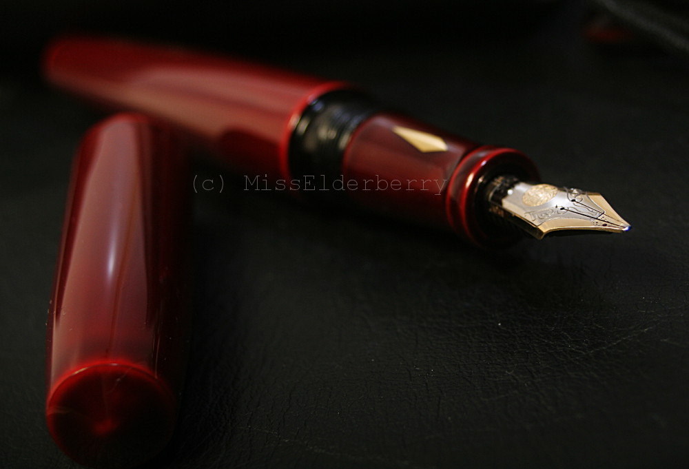
Back to tame-nuri and its two colours. The lighter colour will be applied first. From left to right in the above picture it will be red, red again, green and white. Urushi can be coloured in all shades of the rainbow by adding pigments to the liquid. The shown colours are pretty traditional. Red was one of the earliest Urushi colours and was achieved by adding cinnabar.
Once the underlayer is complete another colour will be added. From left to right that would be black, red, brown and - totally not sure about the last one, maybe brown to or even uncoloured Urushi? From looking at the pen the two colours will now be as one, but at the edges the undercolour will still show. Also due to the semi-transparency of the Urushi lacquer small colour irregularities can be seen under the surface.
Someone once described looking at Urushi lacquer as looking into a deep, clear pond and that's an astonishingly fitting description. It has a depth to it that doesn't compare to your lacquered car, furniture or fingernails. ;-)

More advanced traditional techniques of Urushi lacquer works are Raden and maki-e. Once I get decent photos done I'm planning to do a post on these as well.

Nakaya Long Cigar in heki-tame nuri, with friends.

For reasons unknown to me the colours often show even better on the sections of the pens. Tobacco brown and seladon green - didn't assume it would look good together? Neither did I. But here goes.

Sunday, October 28, 2012

Time for Orange! Iroshizuku yu-yake

Fall is here and winter isn't far either. Today has been the first cold day and we've had the first snowfall in parts of the country. The leaves that have been sporting warm yellows and reds for weeks have now gone limp and will fall in a matter of days. It's high time for warm colours!

Also in inks I find that I prefer cool blues and teals in summer, but keep going back to oranges, reds and brown in winter. At the moment an especially beautiful orange/burnt yellow ink is sloshing around in the tank of my gorgeous Montblanc 149 with super broad oblique nib: Iroshizuku yu-yake.

Iroshizuku yu-yake in Montblanc Meisterstück 149

Definitely one of those inks which are made for wet, wet, wet nibs. It might also work with a narrower tip if the pen is wet enough, else legibility might suffer.

I'm not going to go into the details of ink reviewing a lot since I a) don't have access to a scanner and b) am not 100% sure my monitor is calibrated enough to show the finest nuances of inks plus c) and most importantly I don't have the scientific interest to analyze my inks in terms of flow, feathering and what not.

So in all shortness and very subjectively: That is a really nice ink! Look at the shading. It looks best on ivory or cream coloured paper like the one in the picture. It's 100% cotton Büttenpapier (watermarked paper) by German papermill DFW in Dresden. Like all cotton papers it absorbs quite a bit of ink so you will need a wet pen or the lines will look skinny.

Iroshizuku yu-yake in Montblanc Meisterstück 149

The colour reminds me of something I can't quite put my finger on, maybe something I used to see when I was a child, but definitely something associated with fall. Pumpkins? Crisp, brown leaves on a sunlit path? No, that's not it though close. In any case it's a good memory. Maybe it will come back one day.

The ink also works perfectly with the 149, which currently is my go-to pen for writing letters and journal. It's surprising how easily your handwriting will fit into common boundaries even with such a broad nib as long as there's some line variation involved to keep your letters open (except for the Es, but that's not due to the nib. I manage to get closed-up Es with extra fine nibs - another aspect my handwriting still needs improvement in.)
I also love the ink window, not only for being convenient but also because it reminds me of film rolls.

The text, by the way, is a "Lord of the Rings" quote. I love so many passages of those books, they give me the goosebumps. It's the part where Gimli is scolded by Celeborn for stirring up the evil in Moria and crossing their border and is then consoled by Galadriel. One of my favourites.

Another one is where Gimli tells Legolas about the wonder of the caves at Helm's Deep. (Yes, I like Gimli!)

Saturday, October 27, 2012

The smallest size - Conway Stewart Dinkie

Personal Best of, Part 7


Today I'd like to show you a pen that's on the "Best of..." list because of its size, or the lack thereof. It is small. Petite. Tiny! I'm not really sure if it really is the smallest pen I own because there is still a Stipula Passaporto, in any case the Dinkie's size isn't something that makes it an especially unobtrusive pen but something that calls attention to it.

On my pen tray without something to compare it to it almost looks like a full size pen.

Conway Stewart Dinkie.
Almost.

Now why does somebody like me, someone who likes her pens on the heavier or at least on the larger side, who doesn't post the cap and for whom the hefty "Homo Sapiens" is exactly the right weight, buy - and like - such a pen? Well, to be honest it was mainly the colour, the curiosity factor and it being cheap.


It might well be not only the smallest but also the oldest pen of my humble collection, I'm much too little of an expert to be sure about these things, but to be sure this one has seen a lot of life and it's not always been good.


The green marbled casein plastic body is heavily scarred by scratches and a crack near the lever. Apparently this can happen if you try to force the lever and the ink sac has gone stiff, which they will naturally do over time. So if you encounter a lever filler with rather a lot of resistance, don't force it, your pen could meet the same fate. Luckily enough it's still functioning. It also arrived with me with quite misaligned nib tines which John Sorowka fixed for me.

Pelikan M1000 - Conway Stewart Dinkie - Montblanc 149

Next to a Pelikan M1000 and a Montblanc 149 - yes, that's unfair, but that's the kind of pen size I usually prefer. Astonishingly enough the Dinkie still stands its ground. From what I've heard this was, by the way, not a woman's pen but designed to be carried in a Gentleman's vest pocket.

It was the first time I came across Casein as material for pen cap and barrel and I think this is another fact making the Dinkie rather unique among my other pens. I couldn't really care less about the material until it showed that Casein has the rather astonishing property of being able to absorb a bit of water, thus swelling like a sponge. I learned that one the hard way after a good soaking - though "hard" is not the right word, "the wobbly, enlarged, can't screw the cap back on because the barrel is too big" way would be more exact.
After a good night's rest in a dry environment the barrel was back to its firm self.

David & Goliath: Conway Stewart Dinkie, Montblanc 149

Small pen, small nib: Next to a Montblanc Meisterstück 149. It is, however, a very nice, smooth and soft (though not really flexible) writer with generous ink flow and makes you forget that it is attached to something that, in size, feels like a Bic Stick. Though the amount of ink the sac holds would probably make your novel-writing project a little annoying, it is more than sufficient for everyday use and won't dry out soon either.


A writing sample with Diamine Ancient Copper, a very pretty ink but certainly not the right choice in this pen.  Why?

Ancient Copper is prone to producing a lot of "crud" - consisting of crystallized dye particles - around the nib in the right conditions and the conditions my Dinkie provides seem to be flawless. This crystallizing doesn't mean that the ink is spoiled but is a property of a certain dye, supposedly yellow, which is why this phenomenon occurs with some orange, red and green shades under certain conditions.
I still didn't change the colour yet though since, well, a thorough cleaning is unavoidable and I don't want to meet Mr. SpongePen again. So for now it keeps writing - and crudding - with Ancient Copper, and I keep writing - and wiping the crud off.
Old pens are allowed to have quirks.

Sunday, October 21, 2012

Visconti Homo Sapiens - The coolest piece of rock

Personal Best of, Part 6

A few years ago, Italian pen manufacturer Visconti started to make a compound of plastics and lava stone from the Aetna. They made fittings and the clip out of bronze and gave the pen a two-tone Palladium nib. I think this is a rather brilliant marketing idea, but it wouldn't have helped much if the pens weren't pretty. They are, and more, at least to me.

Visconti Homo Sapiens "Bronze" and "Steel Age", oversize models.
Visconti Homo Sapiens Bronze fountain pen

The bronze pen has been the first. The metal's surface is untreated so it will develop a patina over time. This can be seen on the clip, where the egdes are shinier than the flats. This could easily be polished to a bright shine if you wanted to, but many owners, me included, like to keep a certain patina.

Visconti Homo Sapiens Bronze fountain pen
The knob on the top of the cap, sporting the Visconti logo by default, is magnetic and can be exchanged with gemstones and all sorts of stuff Visconti offers for this purpose. I haven't tried that though and don't intend to.

These pens have a lot going for them. Do you see the matte surface? It's a unique thing to touch. It reminds of me of soft rubber, also feels yielding, though of course it isn't. It will provide good grip without feeling rough. Neither fingerprints nor scratches will show. It will absorb a bit of your hand oils and sweat and always feel dry.

Visconti Homo Sapiens Bronze fountain pen
Some - among which, of course, Visconti themselves - have claimed this to be the most indestructible material that has ever been in use for a fountain pen. I heard a story of a guy whose "Homo Sapiens" fell down three flights of stairs and didn't have a scratch when it reached the ground floor. My "Steel Age", however, has a slight chip on the barrel and it surely didn't endure that much, so... I'd say, it depends.

Visconti Homo Sapiens Bronze fountain pen

That nib is the next special thing. It's Visconti's "Dreamtouch Nib" made of Palladium, and they are nice nibs indeed when working properly (which, sadly, isn't always the case right out of the box) - but is this due to the Palladium? I couldn't say.

To me, and despite writing with fountain pens pretty much, a nib is still a mysterium. Why will some of them feel soft though they aren't more flexible than others? Why will some of them make your handwriting pretty and with others you'll be struggling and never get it quite right? No wonder it seems they have a personality of their own.

Visconti Homo Sapiens Bronze fountain pen

The "Bronze" nib is a rather charming persona. Like all of the well working Visconti nibs it is very wet. It was a factory broad which I sent to John Sorowka for a regrind to cursive italic. There's a writing sample at the end of the post. It's beautiful.

The "Steel Age" nib is a little more diva. It's a factory stub with really likeable line variation - I don't have any other stub/italic quite like this one -, but doesn't like all inks. I had to have it tweaked before it was usable without being totally frustrating because it wouldn't start half of the time. Unfortunately, the chance this happens to your new Visconti nib is relatively high, especially if it's a stub. I hope they will fix this sometime.

 Visconti Homo Sapiens Steel Age fountain pen 
Except for the metal details, the Bronze and Steel Age Homo Sapiens pens are quite the same but the overall impression is very different. You can see that the steel is glossier, the pen looks more grave and businesslike and also more "modern days" than the Bronze one.

Another difference, invisible at first glance, is the filling system. The Bronze is a "power filler" which holds quite a lot of ink even with this gusher of a nib. The Steel Age is a plain piston filler with relatively low capacity, especially with the stub nib using up even more ink than the broad.

  Visconti Homo Sapiens Steel Age fountain pen - single colour nib 
The last picture also shows very clearly one thing speaking against the pen: It is a lot more prone to staining than your average plastic. The greenish shimmer on the edge of the section originates from J. Herbins "Rouge Hématite" the pen is filled with. The section already has been wiped down but it still shows. These stains will eventually go away with a long soak in soapy water and extended rubbing of the barrel with a soft cloth, but I have also heard of stains that have left discolorations, especially the infamous Baystate Blue. In any case, wiping the pen thoroughly with a wet paper towel after filling doesn't hurt.

Some Homo Sapiens also will sweat ink at the very edge of the section, thus potentially staining your fingers. This can easily be fixed by carefully unscrewing the nib unit and applying some silicone grease to the threads.

Visconti Homo Sapiens writing samples: the 1.3 mm stub with J. Herbin Rouge Hematite, the broad cursive italice with Diamine Steel Blue (who names their inks? Does this look like steel blue to anyone?)


Thursday, October 18, 2012

The most ladylike - Montblanc Greta Garbo

Personal Best of, Part 5

(also starring: a Jenni Bick leather journal. Yes, it's getting old, I know. But this pattern just was the perfect backdrop.)

I don't think there's a lot of explanations needed as to why I think this is a very ladylike pen. There are a few pens in my collection - which I will probably show off here over time - which I'd call feminine. That gorgeous Danitrio Mae West which might arrive with me before the weekend (oh, the anticipation!) is one of them. There's also a Namiki Yukari Yozakura Raden with pale pink and purple cherry blossoms. I once had a Montblanc Marlene Dietrich which I sold, definitely a "woman's pen" as well. But when it comes down to the lady factor, none is like Greta.

Montblanc Greta Garbo fountain pen

There is the shape, the colours - black and ivory with an ivory-colored star - and, of course, the pearl set at the end of the clip. There's also the size, which is petite.


I really like the lines of this pen and how that pearl takes center stage. There are also some things I'd like to change about the pen. They are the reason I'd rather hold and admire it than actually use it for writing.


Size and heft, or lack of both, is surely the central aspect. This is a lady's pen, no doubt of it, but even as a woman I like my pens on the heavier or at least a little larger side. It's very light and slim in the hand. Posting the cap would help, but it won't stick securely.
Secondly: Cartridge filler! Due to the taper of the barrel and its overall narrowness no standard converter will fit. It's cartridges or a mini converter (which will hold even less ink than a cartridge. Boo!) My Greta is fitted with a medium nib, which is sensible with regards to ink usage.

I sold the Marlene Dietrich because it had similar reasons going against it - narrow metal section, small ink capacity -, but I can't see myself parting with Greta anytime soon. I'm enchanted by it, even by its flaws.


Sometimes something beautiful just won't follow the rules as to what's convenient and practical. It's content being just beauty.

Tuesday, October 16, 2012

Hand made leather journals - the "art" journal

approximately 200 sheets of various papers and a pouch full of vintage pens. Good to go!

This is the Mr.-Hyde-Journal that never leaves the house unless it's for private purposes. I dedicated it to writing stories and poems and generally taking notes I could use for writing some day. I find the warm, dark brown more inviting for creative work than the businesslike black.


I picked a large wooden pearl for that one's closure ribbon and shimmering tiger's eye for the spine. It's currently holding 3 notebooks, a Leuchtturm1917 with dot grid, a Semikolon Schreibheft and a DIY one with Amalfi paper, that's the one in the middle with the fuzzy edges. It's very nice and special 100% cotton paper with a lovely soft texture, almost feels like cloth. I believe if you crumpled it in your hand it would behave more like a paper towel than something to write on. Unfortunately some pens share this point of view and won't write more than a few lines on it. Others couldn't care less.

I believe I'd love to get a letter written on this paper, it would feel like some precious gift.
OK, enough of Amalfi paper for now, I'll do a more detailed review of it another time since it's definitely one of my most appreciated papers and interesting too. Did you know that Amalfi has one of the oldest papermills in Europe? They learned the craft from the Arabians.

These hold the refills in place (and look quite beautiful besides).
Since this book has a more private character I also decorated the insides of the cover differently. Well, it's more like a "oh, this is nice, let's stick it to the journal" kind of process than actual decorating. Here's a glimpse.

".. like pictures in their head, and if it's a happy picture they smile and if it's a sad picture they cry." (Mark Haddon)
The quote is from Mark Haddon's "The curious incident with the dog in the night-time" where he tells a story about a boy with Asperger's Syndrome - or more like, lets the boy tell the story himself. It's got several great sentences like this one about how he sees the world, his family and people in general. It's also moving and funny.

Sunday, October 14, 2012

Hand made leather Journals - The work journal

By world's best boyfriend


A while ago, I told my boyfriend about journals I had seen around the internet and I said to him I'd like to have something like that in A5 size: refillable, rugged and pretty.The concept is simple: Use a piece of leather to make for a cover. Have rubber strings run down the spine to slip over notebooks and hold them in place.  Have another rubber band attacked to the cover to keep the book closed. That's nearly all. (I'm afraid I'm not explaining this well. Maybe the pictures will help.)

Boyfriend is great with leather and dug just the right hide up: Heavily oiled buffalo, neither stiff nor soft, rugged, beautiful silky6 surface. Something for a nice supple belt, for instance. Really good stuff.


shape and size of your average filofax, though by me much preferred over one.

He made me two books, one black, one chocolate brown. Rounded the corners. Made little ridges in the spine for the rubber strings to fit in. I bought two pearls to make it prettier - I am girl after all -, one mother of pearl, one agate. This black one has become my work journal, I've been carrying it around for the best part of a year now. It ages beautifully.

sturdy rubber strings holding the 3 inserts.

Boyfriend is talented as a craftsman. Needs to have everything perfect once it's finished. I'm different, more the spontaneous, impulsive sort of person, thus filling his perfect journal with battered-looking hand-made notebooks. (Take A4 paper of your choice, 20-30 sheets. Fold in half. Take another sheet of paper as a cover (optional). Take a piece of string. Punch holes through spine, lace string through them, make knot. Done - the sloppy kind of "done", that is.) Still miraculously looks good together.


This motto, attached to the inside of the front cover, is from a postcard which an early tutor of mine had pinned to his office wall. When I got an office wall of my own, I made myself a card to go there. The one that wasn't nice enough for the wall went into the notebook. Silver lining in a nutshell.


closure ribbon with mother of pearl disk + agate pearl gathering the insert strings. 

What about the chocolate brown one? Coming soon.

Saturday, October 13, 2012

the most facets - Danitrio Octagon

Personal Best of, Part 4

(also starring: A Danitrio Takumi and some Jenni Bick leather journals.)

Another Danitrio, this time one that's already here with me! It's an Octagon, one of the two faceted models Danitrio offers. In comparison to Nakaya's decapod pens - which I'm not a fan of so I don't own one - the facets are more rounded and subtle. Still, since Urushi tends to be lighter and more vibrant at edges, it makes the colours pop, so it's just the right choice for tame-midori, a deep and dark forest green.


This is one of the smaller pens of Danitrio's line up, so it's about the length and girth of a Montblanc 149. It fills with a converter (international standard, conveniently).

As all the Danis I've owned yet, it sports maki-e Kanji somewhere on the barrel. Those don't tell anything about me, though, but about the person who painted the lacquer. It must be a good feeling to know that there are things all over the world which carry your name - even if you aren't a movie star or huge entrepeneur. 


This pen is far from home - its nib, however, isn't. Like many pen manufacturers, Danitrio buys their nibs from "Peter Bock" in Heidelberg here in Germany. At the beginning of the 20th century, Heidelberg must have been a metropolis for fountain pens and housed dozens of pen manufacturers. From that fountain culture mainly Montblanc, Pelikan, KaWeCo and Faber-Castell remained. And Bock nibs, which you can meet incognito in pens all over the globe.


the lighting makes the Takumi look faceted as well, it's cylindrical though.

Next to the Octagon there's another Danitrio, a Takumi, in the same colour. In that pen the green is much darker so it's practically black in plain daylight - until held next to black.


in plain light the colour looks very dark.


The most curvy - Danitrio Mae West

New member of the "Best of" list will be arriving soon

I have to show you this gorgeous Urushi pen which will soon be on its way to me from California. Kevin, former seller of Danitrio - he will be retiring from it very soon -, allowed me to use his picture. Thanks, Kevin!


Danitrio Mae West in kawari-nuri Urushi. Picture by Kevin (winedoc).
Aren't those colours great? It's red and golden lacquer painted with a fine brush on a black background. Each hand made pen is unique, this one especially so because it's a prototype and the only "Mae West" model ever done in this style. It will be fitted with a flexible stub nib. Those nibs flex really well. They lay down a lot of ink even when unflexed, but that's just what I want. (Flexible nibs is a topic that deserves a post for itself, if not several).

The pen's unusual name is due to its curvy shape. It may be harder to see on this particular picture, but there isn't one straight line on this pen, everything follows graceful rounded lines. It is about as long as a MB 149 but should be somewhat fatter at the bulged parts. I'll take a picture for size comparison once it gets here.

Once it's shipped it will probably arrive here in one or two weeks. Can't wait!


PS: Take a look at the full review with my own pictures here: Danitrio Mae West II

Tuesday, October 9, 2012

About (my) handwriting

A long way

(also starring: a Lamy 2000, a Lamy Dialog3, some Platinum cartridges and a bottle of Diamine Sapphire Blue. :D)

Rin (kisses) asked me if I could do a post about my handwriting and how it developed over time. Maybe she could do it better than me because of all the letters from me she received during the process, but I'll try to give an impression. Since I tend to keep old notes and stuff until I make a conscious effort to throw them away it shouldn't be too hard. Click on the pictures to enlarge them.


Some time 2009, written with a fine nib.

This is where I started out about 2 years ago. The handwriting is fairly regular, legible (I think) but tiny. It's not that I disliked my handwriting, but I wanted something right-slanted and more versatile so I could use different nib sizes and wasn't limited to EFs. Besides I was getting annoyed by all those letters not being connected to each other; my new script should be cursive.

In fact, using different nibs is one of the greatest things I've discovered since then.

Early 2010, written with one of my first good fountain pens, a ST Dupont Olympio (not in the picture). Ink must be J. Herbin Vert Olive. I was quite into that one at that time.

If you start going somewhere, it's always good to know where you're headed. I didn't, so I wasn't getting anywhere for quite a while. All I knew was that I wanted a right slant and something graceful, copperplate-ish. Also I was a pure finger writer and I wanted to involve my arm and shoulder muscles more (something I still haven't quite achieved). I read a good way to practice this was to make larger letters. On this picture the slant is pretty much 90 degrees and the letters are already a bit more connected than in the first picture.

Later in 2010. The letters are getting more regular, so is the (still very subtle) right slant. Written with my first italic nib, the Pelikan IB (not in the picture).
The progress stagnated for some months. I just couldn't get a decent right slant to the letters - and this is indeed hard if you had a backward slanted handwriting for most of your life. Then I discovered slant guidelines: diagonal lines running over the paper in just the slant you want your handwriting to have. This helps to adjust and I put one behind every sheet of paper I wrote one until I got used to it. That took another few months.

A guidesheet with horizontal and slant lines. I did exercises like the pictured one a lot. Eternal rows of Ms, Ns, Us, LUs and whatnot. Notable improvement came very soon.
Exercises like the one pictured above were invaluable for me. Without these and the slant lines it probably wouldn't have worked out.

Early 2011. Still looks a little weird, like it's not really worn in - which it wasn't. But by that time I started seeing results slowly. Slant is on the way to how it's supposed to be.
During those years I also tried a lot of new pens, papers and inks. In matters of efficiency this probably didn't help, but it was tons of fun. If you want to make quick progress on your handwriting though, I'd recommend getting used to one pen you like and sticking to that one along the way.

http://www.iampeth.com/ is a great resource for different (historic) handwriting styles. Whole books with exercises and instructions can be found here. It's also great for browsing to find out where you want to go.

Early 2012. Regularity is no longer much of an issue, the slant guides are out of business. Still many irregularities in the shaping and sizing of letters, but no longer that obvious. I like to write with broader nibs because they are more forgiving in that respect than fine ones.

Today.

Last picture, transcribed:
9th October, 2012. Still far from where I feel I'd like to be - but getting there, and having as much fun as possible on the way. I'm also still at the very beginning of the journey into the realm of flexible nibs - but, as Michael Ende used to say, that's another story to be told another time.


Saturday, October 6, 2012

The most gorgeous red - Nakaya Dorsal Fin

Personal Best of, Part 3

from left to right: Nakaya Portable, Danitrio Mikado, Nakaya Dorsal Fin, Danitrio Genkai. All red Urushi.

Sometimes when I look at this pen I need to suppress a giggle because I think that this would be the ultimate vampire's pen (yes, I admit, I've read those novels about vampires and stuff and found them entertaining) - and of course I'm not talking about it glittering in the sunlight. I have accumulated a modest collection of red Urushi pens by now - and you will probably get to see some of them over time -, but none is as radiant, as deep and clear in colour as this one. It's just in-your-face: I am a red pen, indeed! I can't help but love it.


2 slits: A Nakaya music nib.
Doesn't the lacquer look as if it's still wet, as if you might leave a smear when you touch it? But the finish is one of the most durable ever. It's hard to achieve and potentially bad for your health as well because the raw lacquer contains a substance called Urushiol which has effects similar to poison ivy. In the cured and dried lacquer, Urushiol is no longer present and the surface is remarkably robust against oils, acids and mechanical stress. One of the few things it doesn't like is excessive sunlight, which brings us back to the vampire thing.


If you order a custom made Nakaya, as I did with this one, the maki-e artists will offer you to personalize the pen with Kanji painted on the barrel. The kanji on this pen are in gold. They say "Writer" in an artistic sense. This should refer to me as well as the pen.

The golden insert in the grip section is called a "Zogan". It's made of a little gold plate then covered with clear Urushi.

Seen enough red pen? Well then. One last close-up of the nib.


Music nibs are very wet and broad writers with stubbish character. I'm going to add a writing sample when I feel like it (PS: Added it. Ha!). At the moment it's inked with Diamine Sargasso Sea, a deep blue with a red sheen - for the little vampire factor from within. 


Which of these reds is your personal favourite?